Warm Autumn vs Soft Autumn: 3 Tests That End the Debate
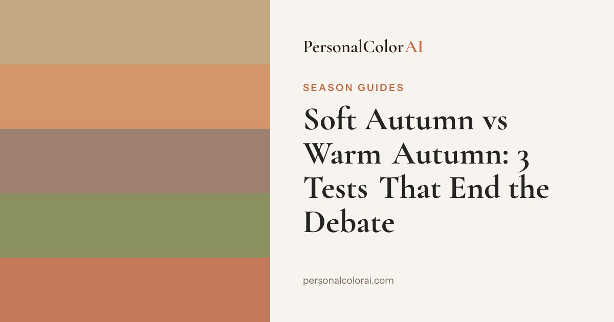
Warm Autumn and Soft Autumn share warm undertones and earthy palettes, but they split on chroma and depth, not temperature. Warm Autumn is vivid and golden — burnt orange, mustard, terracotta, warm bronze. Soft Autumn is muted and neutral-warm — sage, dusty peach, soft camel, warm taupe. Three quick tells: warm gold versus rose gold jewelry, saturated terracotta versus dusty peach, and whether your features stay medium-contrast or melt together.
Why do these two seasons get confused?
Warm Autumn and Soft Autumn are both warm-undertoned Autumn seasons drawing from the same earthy hue families — peach, brown, olive, sage — so a casual glance rarely separates them. This is the twist that makes the pair unusual: unlike most confusable seasons, temperature is not the deciding axis, because both lean warm. What actually splits Warm Autumn from Soft Autumn is intensity — how saturated and how deep your natural coloring is. Someone who gets an uncertain result near the Autumn boundary is almost always sitting between these two, and the overlap is real enough that you need to understand the specific quality that divides them rather than eyeballing the palettes.
The core difference — intensity, not temperature
Warm Autumn is richer, more golden, and more saturated. There is a clear golden cast to the skin, and the natural coloring carries enough depth and warmth to hold strong saturated earth tones — terracotta, olive, warm bronze — without being swallowed by them. Soft Autumn is more neutral-warm, more muted, and lower in contrast. The warmth is present but gentler, closer to neutral than to gold, and the features blend rather than snap against each other. Its palette has to match that softness: dusty peach, warm taupe, and sage sit right, while a saturated terracotta can overpower. Think of it as one sunset seen two ways — Warm Autumn is the sunset in full golden light, Soft Autumn is the same sunset through a sheer curtain, still warm but diffused and quiet.
Three tests to tell them apart
Test 1 — The Jewelry Test
Hold pure yellow gold and rose gold next to your face. Warm Autumn looks best in pure gold, which echoes the golden quality of its natural coloring. Soft Autumn often does better in rose gold or mixed metals, because pure gold can feel too intense against its more neutral-warm, muted complexion. If pure gold looks slightly harsh but rose gold flatters, lean Soft Autumn.
Test 2 — The Color Test
Hold terracotta (#C4663A) against your face, then dusty peach (#D4956A). Warm Autumn harmonizes cleanly with terracotta — its richness and saturation match your natural depth. Soft Autumn looks better in the more muted dusty peach, because terracotta reads too loud against softer coloring. Whichever feels more natural indicates your season.
Test 3 — The Contrast Test
Look at the contrast between your skin, hair, and eyes in a mirror under natural light. Warm Autumn tends toward medium contrast — a visible difference between features, though not dramatic. Soft Autumn tends toward low contrast, with skin, hair, and eyes blending softly without sharp boundaries. If your features seem to melt into each other, that is a Soft Autumn signal.
Find your color season — free analysis
Who each season flatters
Warm Autumn flatters people with a clear golden warmth and enough depth to anchor strong color — Jennie Kim of BLACKPINK and Beyoncé both wear terracotta-heavy and warm-gold looks that match the intensity of their coloring. Soft Autumn flatters gentler, lower-contrast warmth, the kind that looks polished in warm taupe, sage, and dusty peach and slightly overwhelmed by deep bronze — Son Ye-jin and Jennifer Aniston read this way, features blending softly, best colors softened rather than saturated. The full hex-coded wardrobes live on the Warm Autumn best colors and Soft Autumn best colors pages. Both build around earthy warm neutrals; the question is whether you can carry those neutrals at full richness or need them turned down.
Common misreads and what to do
The clearest evidence is what happens in the wrong palette. A Soft Autumn in Warm Autumn's saturated terracotta looks overwhelmed — the color draws attention to itself instead of the face, and the clothing seems to wear the person. A Warm Autumn in Soft Autumn's dusty peach looks washed out from the opposite direction — the shade is too muted for their depth, leaving the overall look flat and underdefined. In both cases the warmth is right and only the intensity is wrong, which is the whole point: getting Autumn right is about matching saturation and depth, not warm versus cool. Sitting on this border is genuinely common and not a mistake on your part. If you land there, a free AI analysis returns a confidence score and secondary season — a 60% Warm Autumn with Soft Autumn secondary means you can shop both palettes with a preference for the richer tones.
Frequently Asked Questions
What's the difference between Warm Autumn and Soft Autumn?
Both are warm Autumn seasons, so they split on intensity rather than temperature. Warm Autumn is richer, more golden, and more saturated, suiting a clear golden warmth. Soft Autumn is more neutral-warm and muted, suiting softer, lower-contrast coloring that sits between warm and neutral.
How do I tell if I'm Warm Autumn or Soft Autumn?
Run the color test: hold saturated terracotta to your face, then dusty peach. Terracotta harmonizing cleanly points to Warm Autumn; dusty peach flattering more points to Soft Autumn. Confirm with jewelry (pure gold for Warm Autumn, rose gold or mixed metals for Soft Autumn) and contrast level.
Can you be between Warm and Soft Autumn?
Yes — it is one of the most common in-between positions because both share a warm undertone and only differ in intensity. A photo analysis with a confidence score and secondary season tells you whether you sit firmly in one or straddle the boundary.
Which autumn type is more common?
Soft Autumn is generally considered slightly more common, since truly golden warm coloring is less prevalent than neutral-warm coloring. Both are among the more common season types globally, which is part of why the pair is confused so often.
Why isn't warm vs cool the deciding factor for this pair?
Because both Warm Autumn and Soft Autumn are already warm-undertoned. When two seasons share a temperature, the split moves to chroma and depth instead — whether your coloring can carry saturated, deep earth tones or needs them softened and muted.