What to Wear for Bright Spring: Outfit Formulas in Your Warm, Vivid Palette
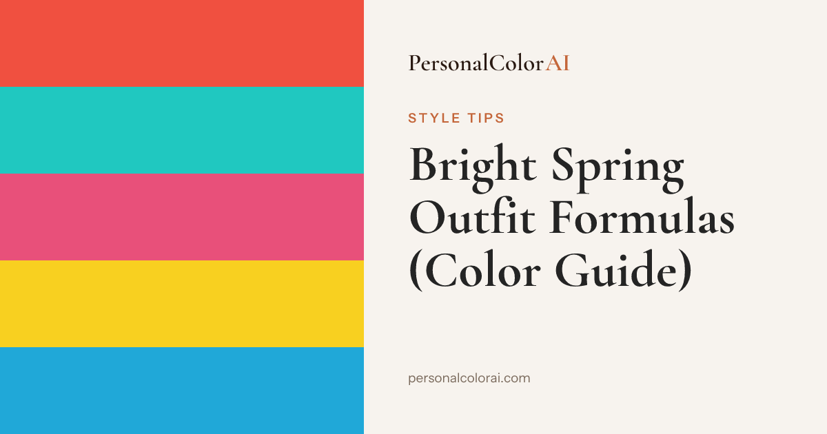
Bright Spring outfits work best built on light warm neutrals — warm ivory, cream, and bright navy — then charged with the season's vivid accents: hot coral, bright turquoise, warm fuchsia, and clear yellow. Keep charcoal, dusty rose, and muted olive off your face. Reach for gold jewelry and clean medium-blue denim, and don't dilute the color — this season is built for full saturation.
Most seasons build a wardrobe by choosing safe neutrals and adding color carefully. Bright Spring works the other way around: your coloring is warm, clear, and high-contrast, so vivid color is the point and the neutral is just the frame that lets it ring. Play it too muted and you switch your own face off.
What should a Bright Spring wear?
A Bright Spring should wear a light warm neutral as the base — warm ivory, cream, or bright navy — and let the season's vivid colors do the talking: hot coral, bright turquoise, warm fuchsia, vivid yellow, and clear orange. Pair with gold metals and a clean medium-blue denim wash. The colors to keep away from your face are the muted and cool-dusty ones: charcoal, dusty rose, cool gray, and olive drab, which sit on the Bright Spring worst-colors list for exactly this reason.
Which Neutrals Anchor a Bright Spring Wardrobe
Bright Spring doesn't do dark, heavy neutrals well — pure black and charcoal drain the clarity out of your face. Your workhorse neutrals are warm ivory and cream up top, and bright navy when you want depth without going to black. Bright navy is the closest this season gets to a 'serious' dark, and it holds contrast against vivid accents far better than gray ever will.
For denim, stay in the clean medium-blue range — a bright, slightly warm wash rather than an inky black or a gray-black. Black denim is the one staple to buy sparingly; if you own it, keep it below the waist and let a warm ivory or vivid top carry the face.
Which Accent Colors to Reach For
Every accent in your kit comes straight from the Bright Spring palette: hot coral, bright turquoise, warm fuchsia, vivid yellow, clear orange, warm red, spring green, and bright aqua. The rule is saturation — these should be clean and full-strength, never dusted or grayed. Two vivid colors together (coral and turquoise, fuchsia and yellow) is a signature Bright Spring move that reads as intentional rather than loud.
3 Head-to-Toe Bright Spring Formulas
Formula 1 — The clean brights. Warm-ivory top, medium-blue denim, hot coral flat or bag, gold hoops. This is the everyday uniform: a light warm neutral doing the anchoring while one hit of coral keeps your natural warmth switched on. Add a bright turquoise scarf if you want the two-accent version.
Formula 2 — Color-on-color. Bright turquoise top with a warm-fuchsia or clear-orange accent — a bag, a shoe, a belt — over cream trousers. Bright Spring is one of the few seasons that can wear two vivid colors at once without it fighting. Gold jewelry ties the warmth together.
Formula 3 — Vivid tailoring. Bright-navy blazer over a warm-ivory shell, cream or medium-denim below, and a vivid-yellow or coral pocket detail near the face. The navy supplies the contrast this high-contrast season wants; the vivid accent keeps it from reading corporate-flat.
Building a Bright Spring Capsule
Start with three warm-neutral anchors — a warm-ivory top, cream trousers, and a bright-navy layer — plus one clean medium-blue denim. Then buy accents in your four strongest colors: hot coral, bright turquoise, warm fuchsia, and vivid yellow. Because everything in the accent set is warm and clear, any accent works over any anchor, which is what makes a small Bright Spring capsule feel much larger than it is.
Metals are simple here: gold, brass, and warm rose gold. Silver goes flat against your warmth, so if you love a cool metal, keep it to small pieces away from the face. Our gold or silver for Bright Spring guide breaks down the exact reasoning.
We're building an outfit-check tool at PersonalColorAI — snap a photo of what you're about to wear and get a fast read on whether the colors sit inside your season before you walk out the door. It's rolling out inside the analysis result flow, and you can join the waitlist when you run your free color analysis. If you already know you're a Bright Spring, it's the fastest way to pressure-test a two-accent outfit before you commit.
Find your color season — free analysis
Frequently Asked Questions
What colors should a Bright Spring avoid wearing?
Muted and cool-dusty shades near the face: charcoal, dusty rose, cool gray, mauve, and olive drab. They gray out Bright Spring's natural clarity. Pure black is also heavy — bright navy is a better dark for this season.
What is the best neutral for Bright Spring?
Warm ivory and cream for lights, bright navy for depth. These hold contrast against vivid accents without draining the face. Charcoal and pure black are the neutrals to use sparingly, kept below the waist rather than near the face.
Can Bright Spring wear black?
In small doses and away from the face. Black flattens Bright Spring's warm clarity, so use it for shoes, bags, or bottoms and let a warm-ivory or vivid top carry the top half. Bright navy is a more flattering dark whenever it's an option.
What denim wash suits Bright Spring?
A clean medium-blue wash, slightly warm rather than gray or inky. Bright, fresh denim echoes the season's clarity. Black and gray-black denim work only below the waist, never as the piece nearest your face.
Should Bright Spring wear gold or silver jewelry?
Gold. Bright Spring's warm undertone pairs naturally with gold, brass, and warm rose gold. Silver reads flat against the skin — if you love it, keep it to small pieces worn away from the face.