What Color Season Is Gal Gadot?
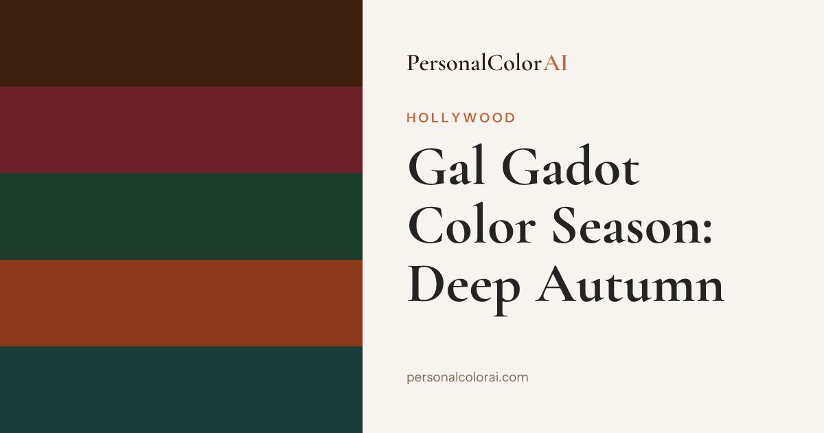
Gal Gadot reads as a Deep Autumn in the Korean 12-season system. Her warm undertone, deep brown hair, and warm green-hazel eyes give her a rich, deep coloring that comes alive in earth and jewel tones. She looks best in olive, terracotta, and forest green, and gets cooled and flattened by the icy silver and pastel styling her Wonder Woman press tours often lean on.
Gal Gadot is often styled in cool metallics and steely blues, the visual language of a superhero franchise, and it is easy to assume that is her palette. Look at her out of costume in warm light, though, and a different truth shows up: golden-warm skin, deep brown hair, and green-flecked hazel eyes that all glow when the colors go rich and earthy. That is a Deep Autumn. Here is the coloring behind the call, the palette that lights her up, and the one place analysts genuinely argue over her.
What color season is Gal Gadot?
Gal Gadot is best analyzed as a Deep Autumn: warm undertone, deep depth, and medium-to-high contrast. The defining features are warmth and depth together, her skin carries a golden-olive cast rather than a rosy one, and her hair and eyes are genuinely dark, so she can take rich, saturated colors that would swallow a lighter person. That combination of warmth and depth is exactly what the Deep Autumn season is organized around, colors that are warm, deep, and turned up in richness rather than in brightness.
The coloring cues behind the call
Start with undertone. Gal's skin reads golden and warm, tanning easily to a bronze rather than staying pink, which is why warm ivory and gold sit beautifully on her and cool bluish bases can look ashy. Next, her eyes: a warm green-hazel with amber and brown flecks, the kind of eye that deep olives and forest greens make luminous. Then depth, her natural hair is a rich dark brown, deep enough to carry espresso and burgundy without being overpowered. Her contrast is medium-to-high, but crucially it is a warm contrast, not the cool blue-black-against-porcelain contrast of a Winter. Warmth is the deciding thread through all of it.
Signature looks: where the palette works and where it fights her
Gal is at her most radiant in warm, deep colors, olive gowns, rust and terracotta, deep gold, and rich bronze, which pick up the warmth in her skin and set her eyes glowing. Warm chocolate and forest green do the same. The contrast case is the icy, cool styling she is so often given, the silver-sequin and steel-blue looks of superhero press, and pale cool pastels, where her skin can go slightly sallow and the color sits coldly against her instead of harmonizing. She is stunning through sheer bone structure regardless, but the cool palette is doing her no favours, it is fighting the warmth that is her strongest asset. Rich warmth lifts her, icy coolness flattens her.
Best colors for Gal Gadot
Her power shades are olive, terracotta, forest green, deep gold, burnt orange, and espresso, with warm chocolate and camel as neutrals rather than black or cool grey. The full hex-coded set lives on the Deep Autumn best colors page. The quick rule for a Gal-type face: reach for colors that feel warm and deep, like autumn leaves or spice, and avoid anything icy, pastel, or dusty-cool, which reads flat against her. For makeup, lean warm and rich, a brick or warm-berry lip, bronze and copper on the eyes to echo the amber in them, and a warm-based foundation, all mapped on the Deep Autumn makeup guide.
Colors and styling that fight her
Her weak points are pastel pink, icy blue, cool grey, fuchsia, and stark cool-based white. Each one fights her warm undertone, and the pale, cool ones also fail to match her depth, so they leave her looking washed out and cold. Cool-toned silver jewelry has the same dampening effect that its steely styling does, warm gold suits her far better. Even true black, a color she wears constantly, is not her strongest, a very deep espresso or forest green frames her face with less of a hard, cool edge. Warmth and depth together are her friends, coolness and paleness are not.
Where analysts push back on Gal's season
The honest debate on Gal is Deep Autumn versus Deep Winter, the two deepest, most saturated seasons. Both are dark and high in contrast; the split is undertone. Deep Autumn reads her as warm, Deep Winter as cool, and because her contrast is high and she is so often shown in cool styling, a Deep Winter case gets made regularly. The deciding factor is her skin, which reads golden rather than porcelain, and her eyes, which are warm hazel rather than cool, both pointing warm. Both seasons let her wear rich deep colors, so the overlap is real, but warmth is what tips her to Autumn. Compare her against a genuinely cool, clear-eyed face in the K-pop idol color season list and the warm-versus-cool difference is obvious.
Find your color season — free analysis
Find your own color season
Think you share Gal Gadot's warm, deep coloring? Upload a selfie and our free AI analysis reads your undertone, depth, and contrast and places you in one of the twelve seasons in about a minute, then hands you the palette to shop from.
Frequently Asked Questions
What color season is Gal Gadot?
Gal Gadot reads as a Deep Autumn, based on her warm golden undertone, deep brown hair, warm green-hazel eyes, and medium-to-high contrast. Some analysts argue Deep Winter because of that contrast, but her warm skin and eyes point to Autumn.
What is Gal Gadot's undertone?
Warm. Her skin reads golden-olive and tans to bronze rather than staying pink, so warm ivory, gold, and earth tones suit her, while cool bluish bases and silver can look ashy against her.
Is Gal Gadot a Deep Winter instead of a Deep Autumn?
It's the one real debate about her, driven by her high contrast and the cool styling she's often given. Both are deep and saturated, but the deciding factor is undertone: her golden skin and warm hazel eyes read warm, which tips her to Deep Autumn over the cool Deep Winter.
What colors look best on Gal Gadot?
Olive, terracotta, forest green, deep gold, burnt orange, and espresso, with warm chocolate and camel as neutrals. The rule is warm and deep, like autumn leaves or spice, over anything icy, pastel, or dusty-cool.
What colors should Gal Gadot avoid?
Pastel pink, icy blue, cool grey, fuchsia, and stark cool white. They fight her warm undertone, and the pale ones also fail to match her depth, leaving her looking washed out. Cool silver dampens her too; warm gold is far better.
How can I tell if I share Gal Gadot's Deep Autumn coloring?
Check whether warm, deep, rich colors flatter you more than icy pastels, and whether gold suits you better than silver. If earthy jewel tones make your skin and eyes glow while cool tones leave you flat, you likely share her Deep Autumn coloring. A photo analysis confirms it in under a minute.